Mobile App Design
2021-2022
Lolliboom Cam
About
During the process of more than ten version iterations over seven months, I participated in important design requirements such as the [Project 01] optimization of the share function, [Project 02] revamp of the template page, construction of the membership system, and establishment of a design system.
Role
Project 01: Optimization of the Share Function
Overview
- What's Lolliboom Cam?
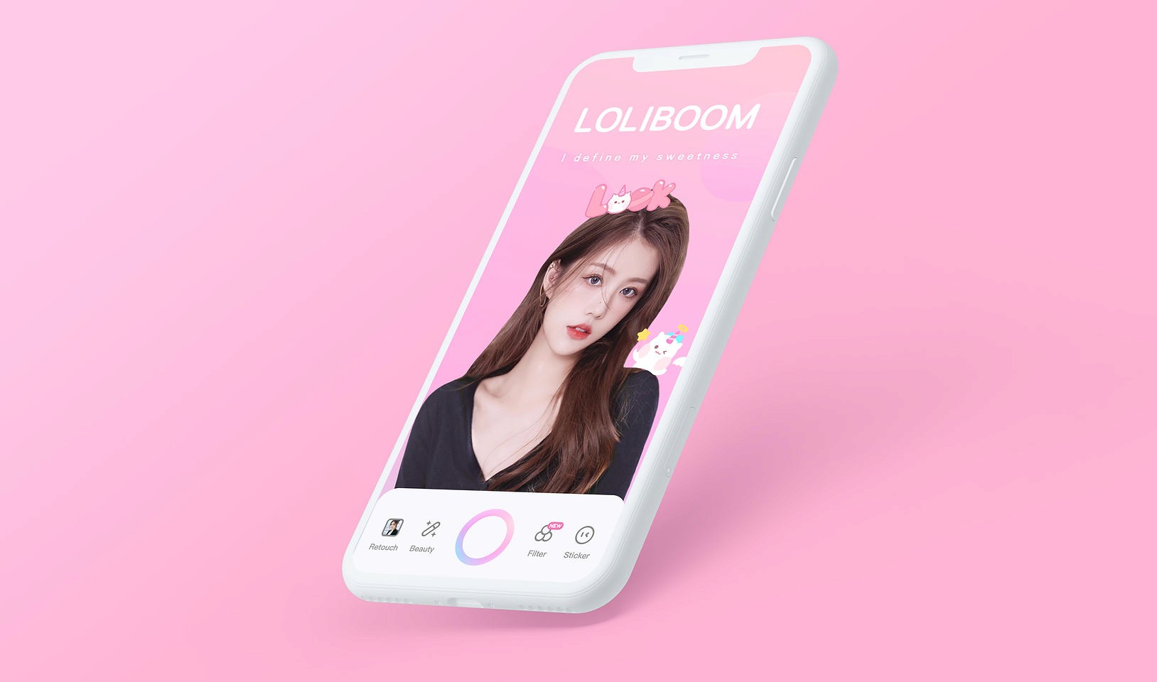
Lolliboom Camera includes several functions such as photographing, photo editing, template generating, video recording, and rhythm matching. The share function refers to the entire process of launching, saving, and sharing.
- What's the problem?
In the previous design update, we achieved our short-term business goals (increased sharing conversion rate on the main page). However, based on the design plan at that time, we still identified new issues.
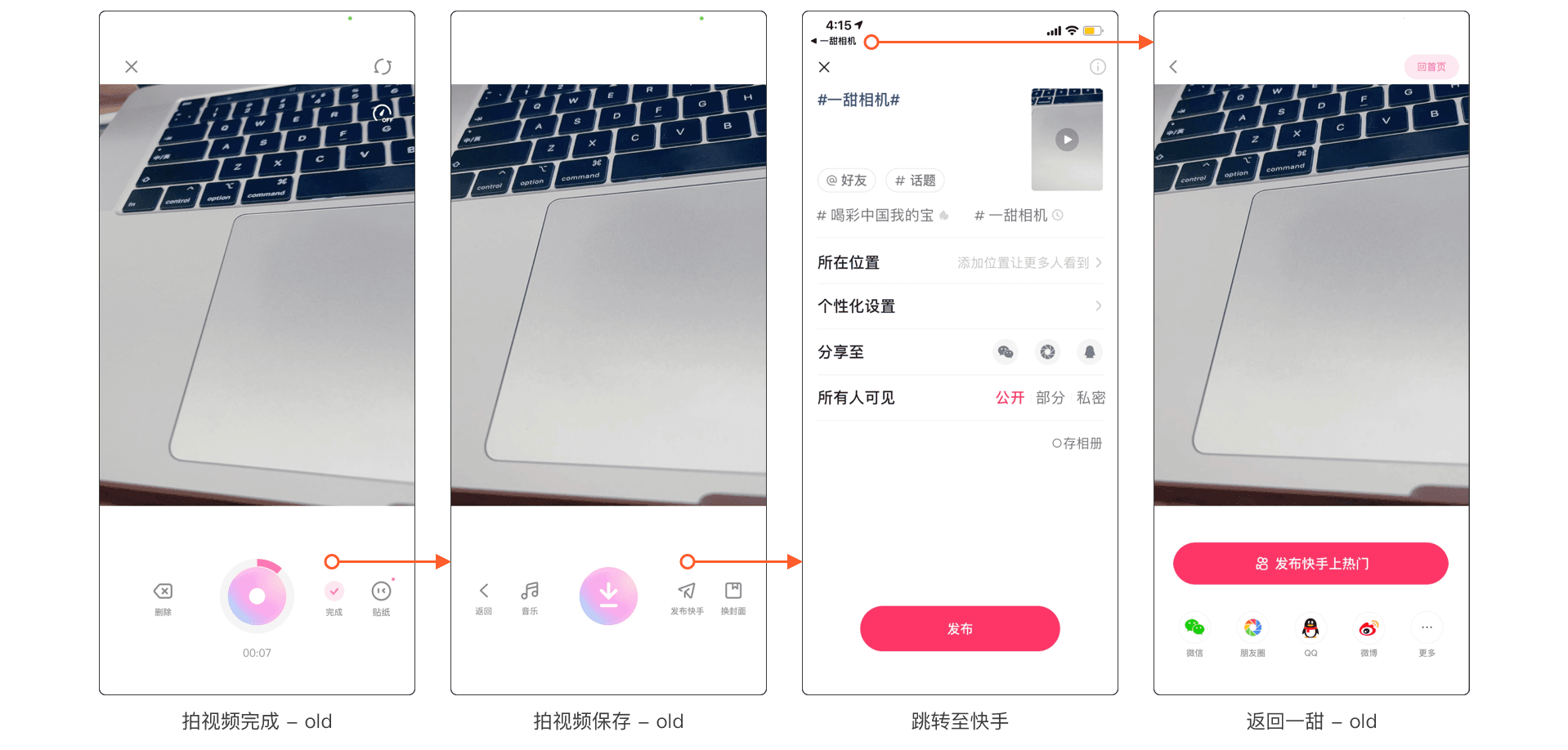
Take Video Recording as an example
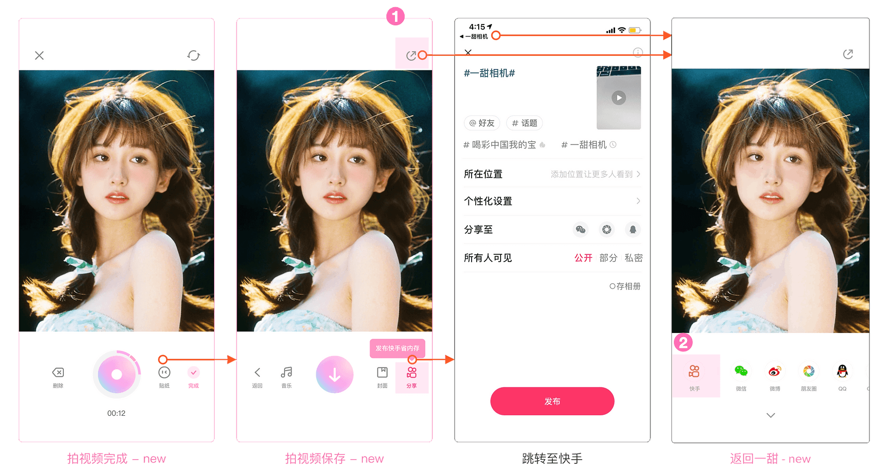
Video Recording - Complete
Video Recording - Share
Redirect to Kuaishou
Back to Lolliboom
(a) The sharing screens of different function modules have a huge gap, resulting in a high cognitive load for users.
(b) The path to sharing on other platforms is long, making it difficult for users to discover; using text buttons to encourage users to share their works on Kuaishou can make users feel "tricked" and generate negative emotions
(c) The layout of the page contains designs that go against the user's operation habits
01 Business Perspective
Sacrificing user experience of the share function to achieve the business goal can be an overcorrection.
02 User Perspective
The freedom of choice is taken away in the sharing process, leading to low efficiency in usage.
Product Goal
Long-term goal: Increase MAU (monthly active users).
Short-term goal:
Maintain a stable share conversion rate on the main site, continue to attract more authors and works to the main site.
After the redesign, the data should remain stable or experience a slight decrease (due to the removal of data caused by forced sharing in the past).
User Goal
Efficiently complete tasks.
How might we guide users to share while also keeping the user experience smooth and convenient for long-term user growth?
Data Analysis
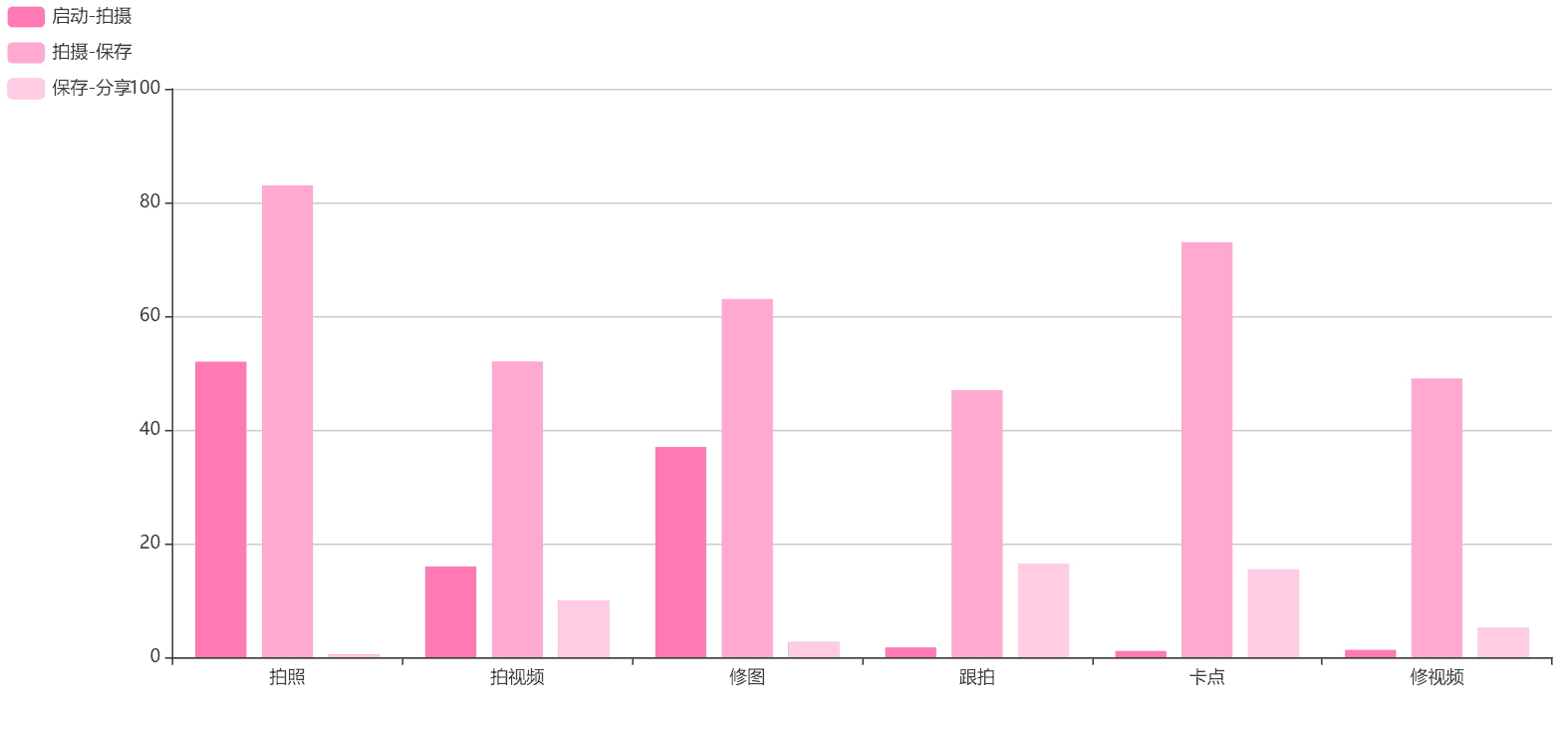
Currently, as the two modules with the highest production volume, the conversion rate from save to share is relatively low for photographing and editing, leaving room for improvement.
The share conversion rate for rhythm matching is the highest among all features, but due to the high barrier of use, the launch-save conversion rate is low.
- Insights
(a) The usage rate of image processing functions is the highest, but users have a lower willingness to share to Kuaishou (slightly out of alignment with Kuaishou's short video platform positioning). Therefore, it is possible to increase user growth through design by: (1) letting users know that they can share photos on Kuaishou; (2) allowing users to share to other platforms to attract users through social media
(b) Entertainment video functions have a high conversion rate but low usage. User engagement can be improved by guiding users and reducing the learning cost
Design Principle
01 Respect
Respect user's intent
A friendly and approachable text tone
02 Efficiency
Conform to user awareness
02 Pleasure
Visually fresh and lively
Final Design
01 Photo
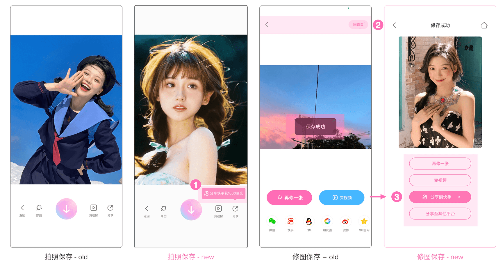
Photo Shooting - Save - old
Photo Shooting - Save - new
Photo Editing - Save - old
Photo Editing - Save - new
(a) [Visual guidance] Add a slowly floating tooltip and rotate the share icon into the Kuaishou logo after 1 second
(b) [Text prompt] Text in the tooltip educates users on how to share photos on Kuaishou
(c) [Information hierarchy] The page is clear and concise, emphasizing "share to Kuaishou" visually and hierarchically
(d) [High scalability] If more photo editing functions are added in the future, the layout will be more reasonable
(e) [Consistency] Share page layout of the shooting module (photo & video) and the editing module (photo & video) keeps aligned
02 Video Shooting
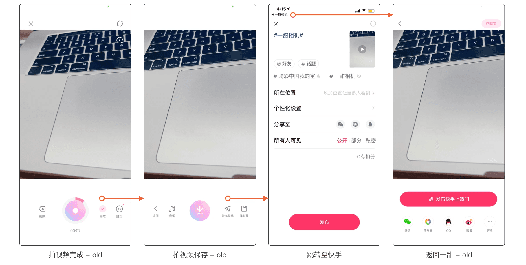
Video Shooting - Complete - old
Video Shooting - Save - old
Redirect to Kuaishou
Back to Lolliboom - old
Video Shooting - Complete - new
Video Shooting - Save - new
Redirect to Kuaishou
Back to Lolliboom - new
(a) [Visibility of system status] Button text and icon meaning are consistent, with no ambiguity in user understanding, and no misleading users
(b) [Flexibility and efficiency] Divert user behavior, enabling users who choose to share on Kuaishou and other platforms to achieve their goals quickly
(c) [Error prevention] If the user wants to share to other platforms, there are two paths:
03 Exclusive Feature: Following Shooting
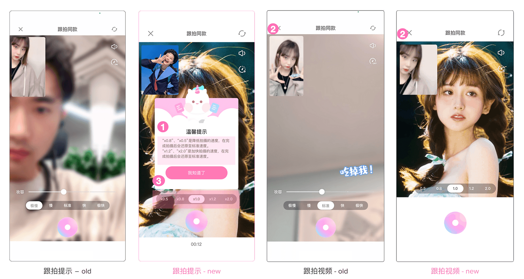
Following Shooting - Guide - old
Following Shooting - Guide - new
Following Shooting - old
Following Shooting - new
(a) [Avoiding ambiguity] Modify the on and off states of the variable speed icon, and use checkmark symbols to represent the on and off states. The on state indicates that the effect is on, helping to distinguish between opening the variable speed panel and turning on the variable speed effect, avoiding ambiguity
(b) [Flexibility and Efficiency] Research has shown that there is significant ambiguity in understanding the terms "fast" and "slow" when referring to variable speed, with a high cognitive load. To make it more concrete, the text information has been changed to a specific rate, and the small window tutorial matches the rate as the user switches the progress bar
(c) [Consistency] Uniform layout for the sharing page in the video processing module
Other Design Solutions
Data Feedback
Overall, there are ups and downs in the performance of the data within two months.
However, the overall conversion rate of share has increased, and the conversion rate of sharing to Kuaishou has slightly decreased, but no more than 0.5 percentage points, which is within the expected range in the early stage of the program design, due to the removal of some forced sharing data
Also, most data of first-time users has risen (The number of Photo Editing - shared works on Kuaishou +0.215%, Conversion rate of sharing edited photos to Kuaishou on Lolliboom +0.175%), while part data of existing users has gone down.
- Insights
(a) The increase in both the quantity and significance of items in the core data for new users, compared to the decrease in such items for old users, aligns with our expectations. This outcome is attributed to the enhanced user-friendliness of the new interactive project design for newcomers.
(b) For current users, the significance of increasing items is slightly less than that of decreasing ones. This could be attributed to the relatively brief duration of the A/B test experiment, which took place from 08/26/2021 to 10/12/2021. If the experiment is extended and users become more accustomed to the new design, we anticipate an improvement in the data.
Project 02: Revamp of the Template Page
Overview
- What's the problem?
The template module has been online since July 2021 and has undergone several revisions. The functionality has gradually become rich but cumbersome. We have received feedback from users regarding some experience issues, and the design of the initial version has become outdated. Therefore, it is necessary to redesign the module.
User Research
In November 2021, we administered a user experience satisfaction survey to active users of Loliboom, garnering 11,502 valid responses. Notably, the Net Promoter Score (NPS) exhibited a significant increase, rising from 32.9% in September to 45.9%. Among them, the usage rate of the template function has increased from 21.5% to 55.7%.
Additionally, we gathered feedback from users who expressed dissatisfaction with the template function.
Among them:
28.9%
of users reported that they couldn't find a quick way to quit the template page.
27.3%
of the users reported that they couldn't quickly find the desired functionality in the template module.
Competitive Analysis
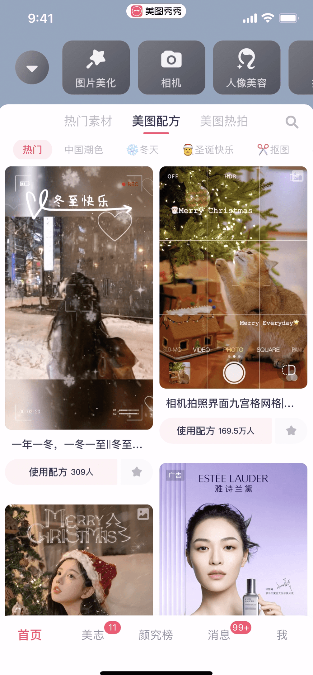
Meitu
When the user scrolls down, the top banner, search, and toolbar are all collapsed to increase the display area of the feed
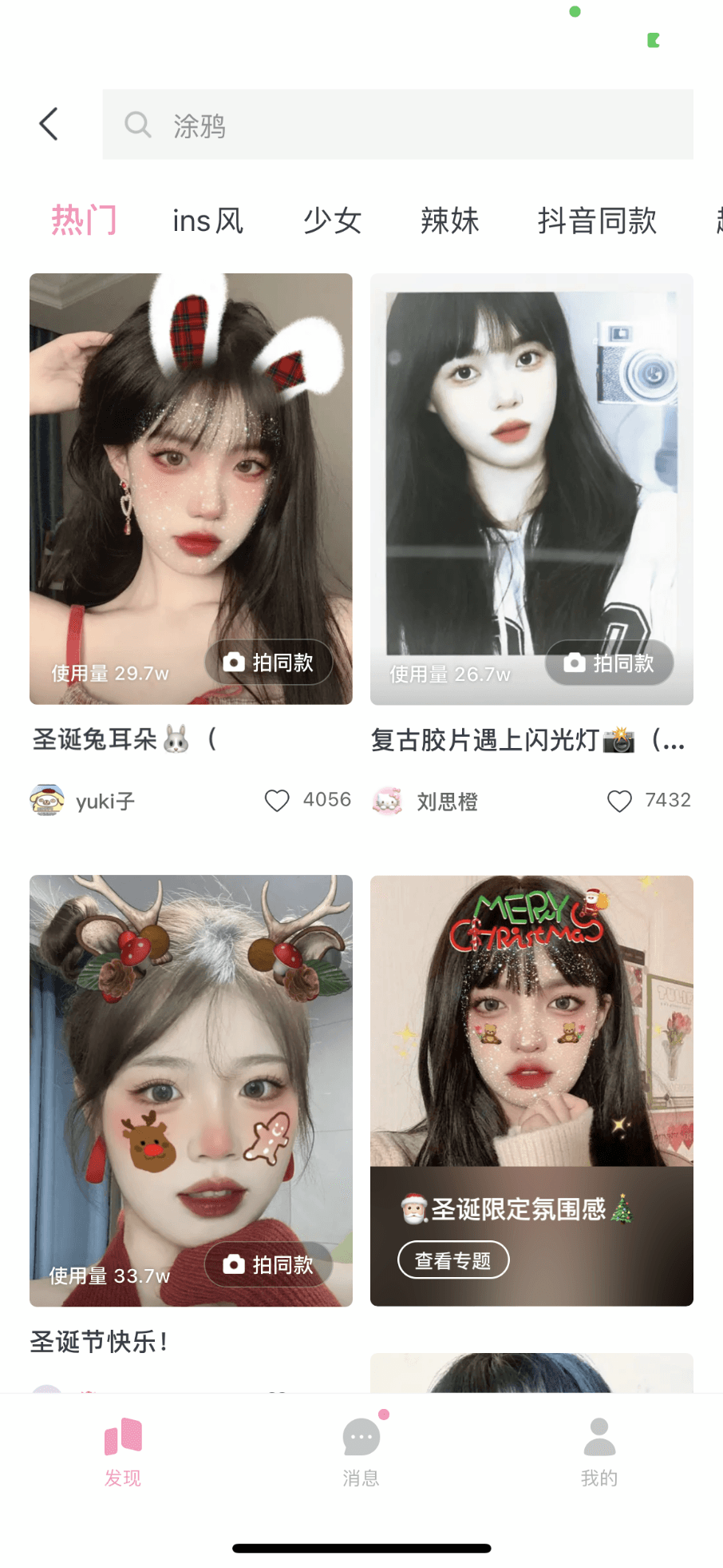
Ulike Cam
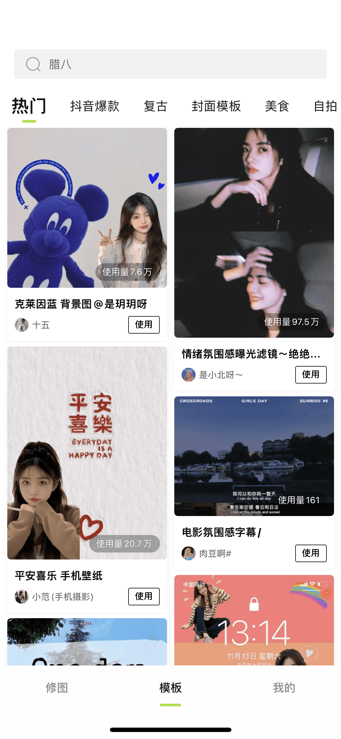
Xingtu
The top tabs are all streamlined to provide more space for the feed flow
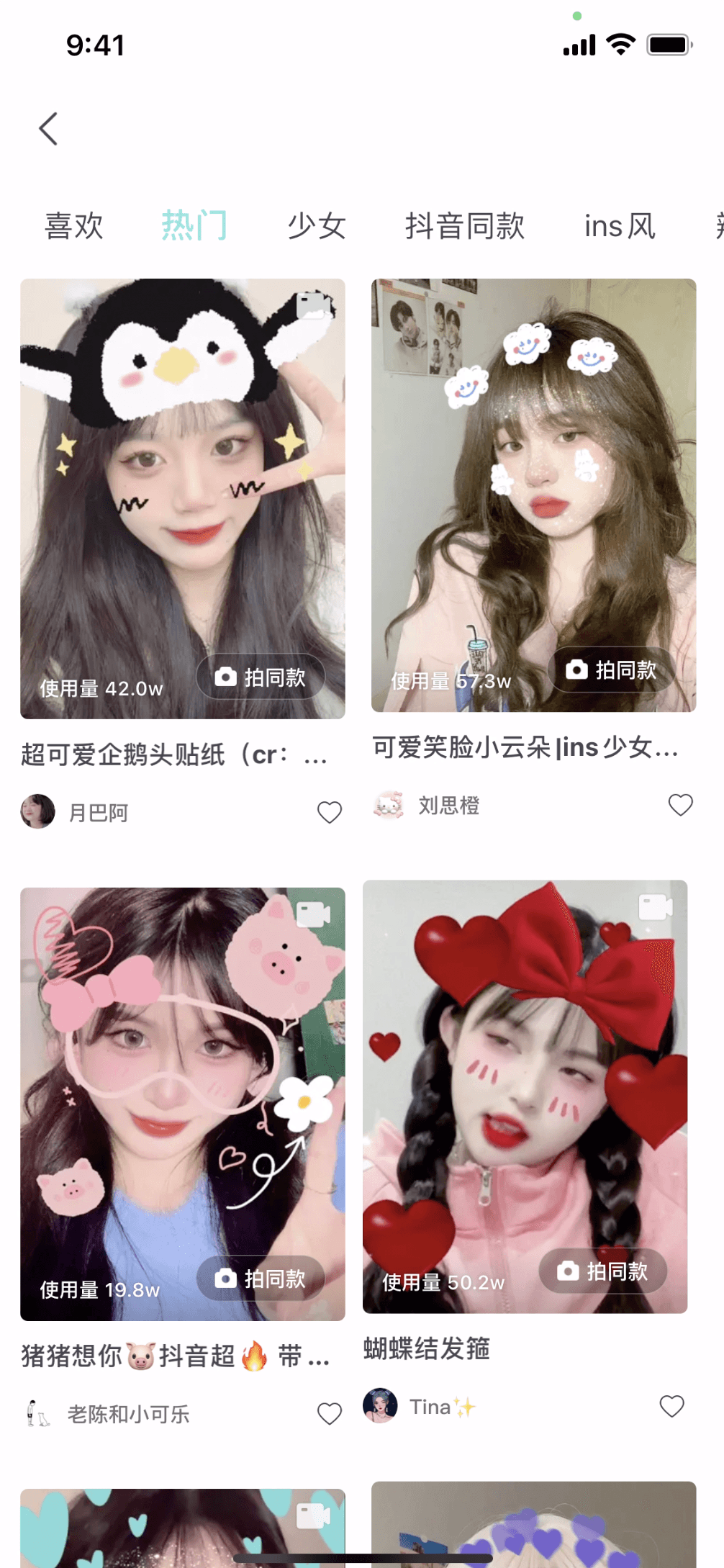
faceu
Appearing in the form of a secondary page, without a bottom bar to increase the display area.
Inspiration: Competitors have a larger display area for the feed stream overall, and the use of a bottom tab design can avoid inconsistencies in the return interaction
Opportunity: However, most competitors cannot quickly return to the top or quickly access the user profile in the downward state
Current Interface Analysis
- The initial state of the template page
- The down-scrolling state of the template page
After scrolling down on the template page, the path to quit is long, which may not be easy for new users to perceive.
How might we improve screen utilization efficiency?
How might we optimize the interaction logic of returning?
How might we retain as many other functional portals (search, personal page) as possible to meet users' quick operation needs?
Final Design
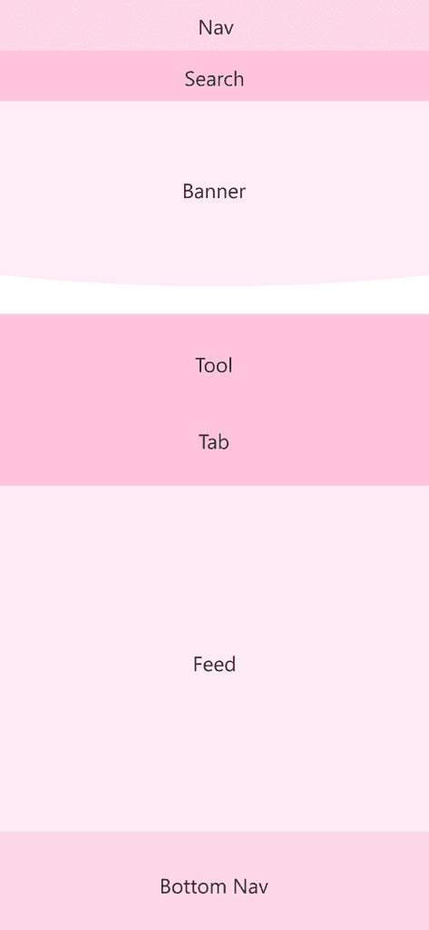
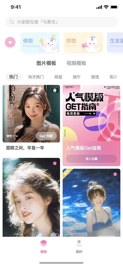
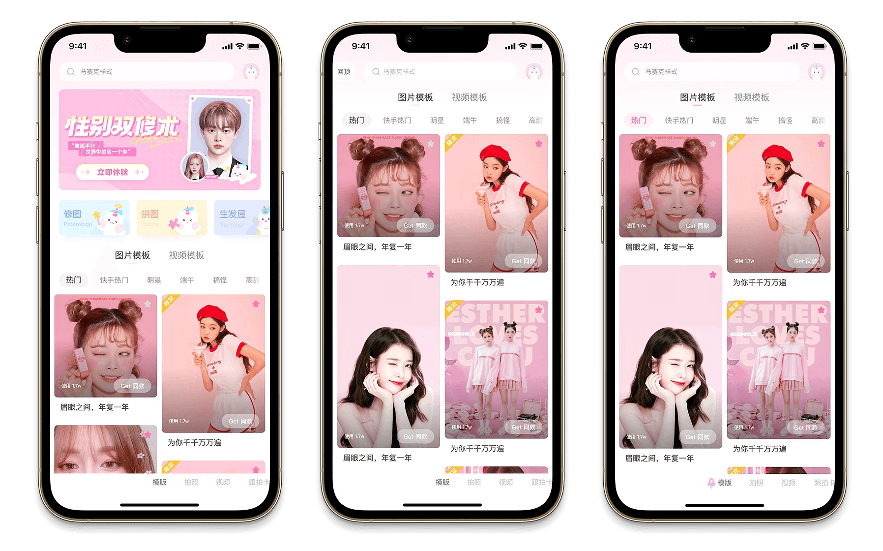
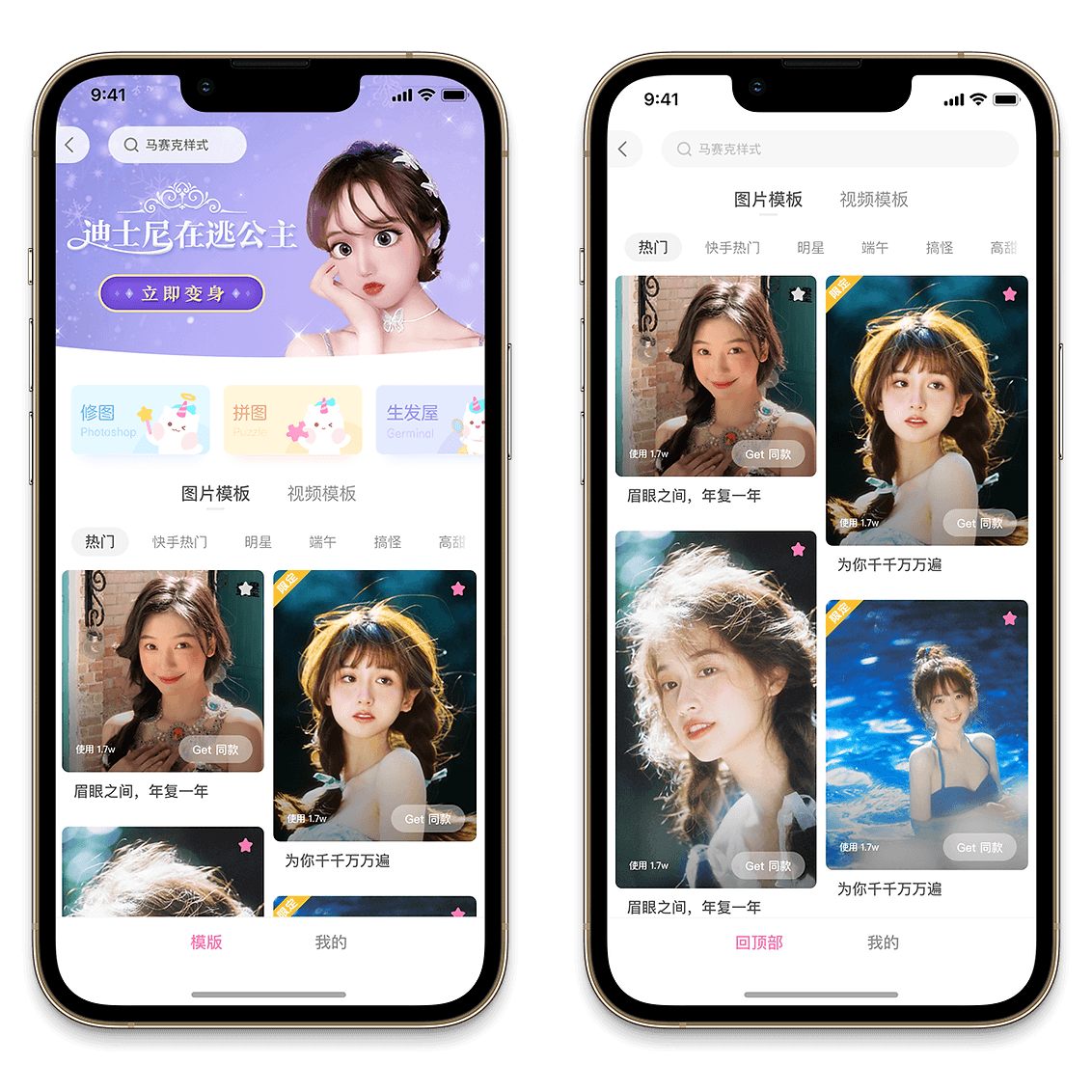
Proposal A
[Initial State]
Make the template function the primary page, thus completely eliminating the issue of returning, and also facilitating the switching of core functions
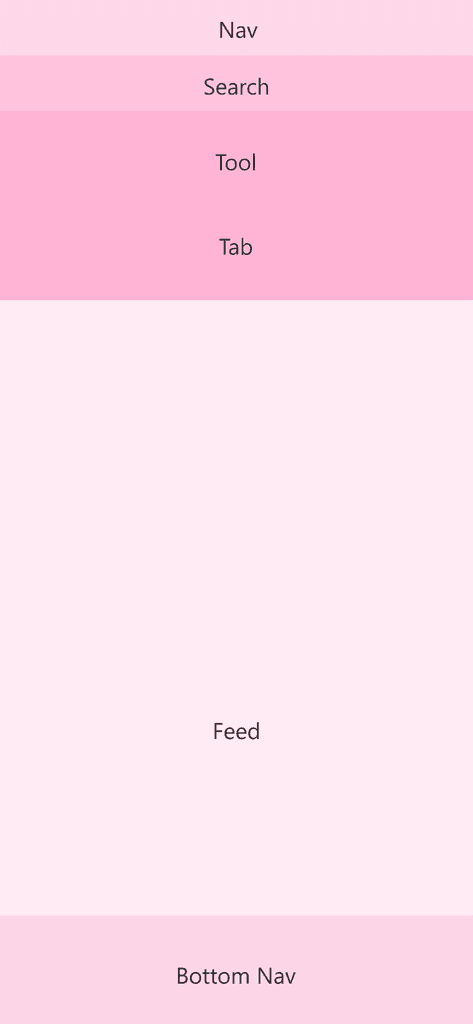
[Down-scrolling State]
Pin the portal of the profile page
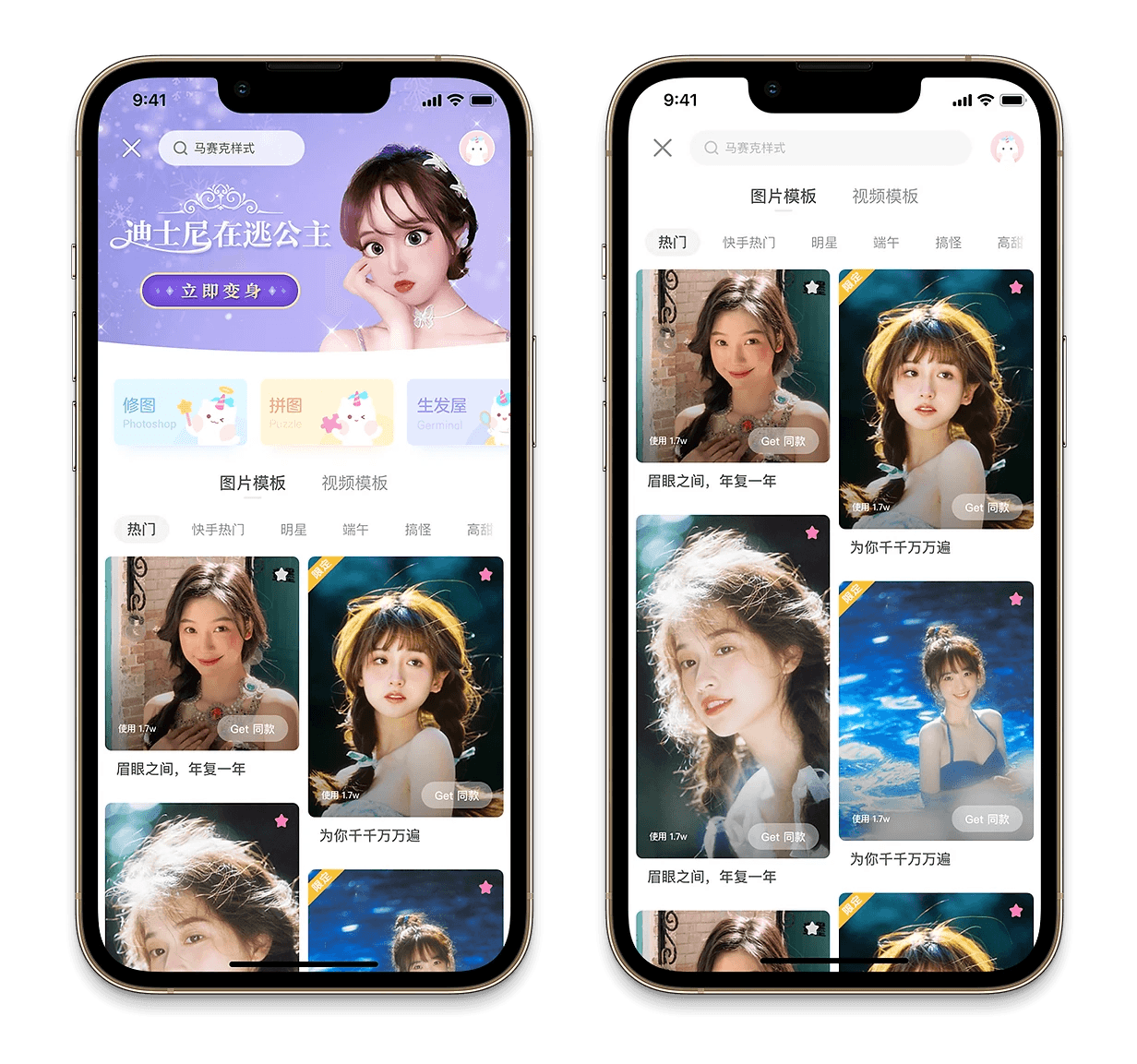
Proposal B
[Initial State]
Modify the style of the bottom tab and reduce the height of the tab bar
[Down-scrolling State]
Make the back button more visually prominent in style
Proposal C
[Initial State]
Remove the bottom tab and place the portal of the profile page within the banner
[Down-scrolling State]
Hide the bottom Nav Bar
After discussions between the design and product teams, a consensus was reached to adopt Proposal A.
