AI Product Design
2022
Microsoft Azure ML
About
Design Sprint of AzureML Designer, and Metrics Advisor UI Revamp at Microsoft
Role
Overview
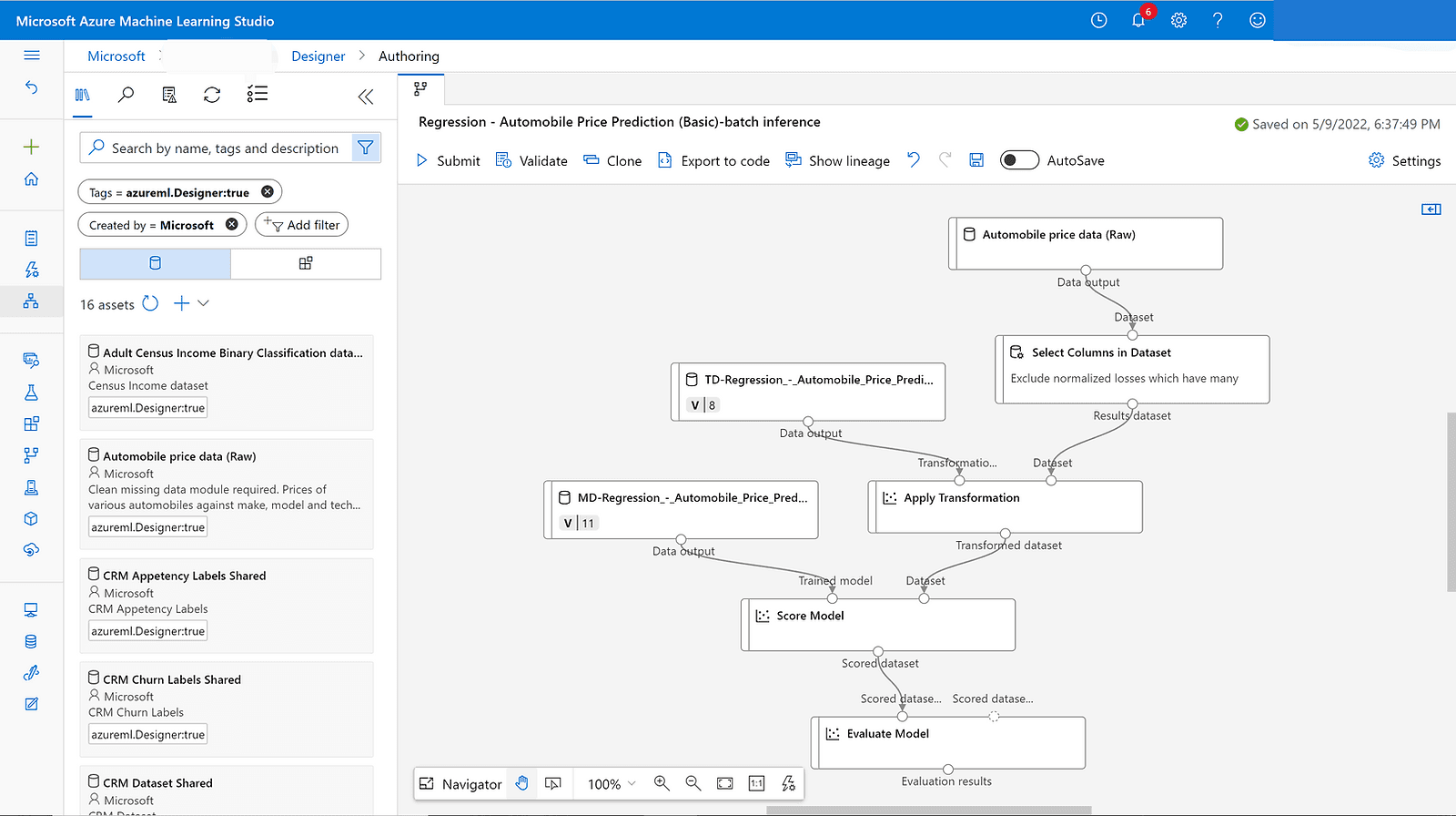
- What's AzureML?
- Brief
The design sprint lasted 8 weeks in total, 12 designers were involved. Four as advisors, and the rest was divided into two groups.
- What I did
I was responsible for contributing exploration ideas, building moodboards, designing interactions and prototypes, and delivering final designs.
I played the lead role of Group B of four designers, including full-time employees, specified in interaction, visual, animation, etc.
Background
- Why design sprint?
AzureML is professional, Definitely precisely designed for data scientist to manage the machine learning lifecycle, under an accurate design system
But high entry barrier, which means hard for novices to start
We'd like to delight users..., improve productivity and user experience of authoring/debugging experience of complex pipeline graph for higher user satisfaction
- What we want?
We focused on building pipeline workflow in this sprint
Define
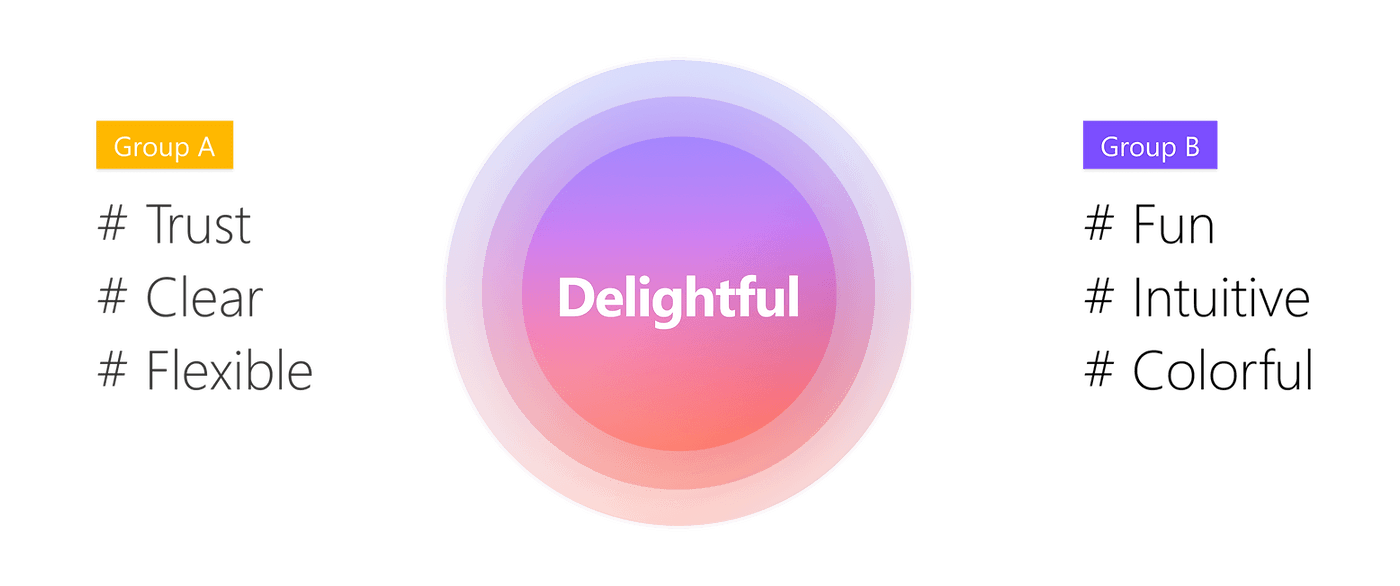
Leveraging random association, we tried to think outside the box. We generated 140+ keywords in total, and finally narrowed them down to three for each group.
As Group B, we took the key words Fun, Intuitive, and Colorful
Moodboard
- What problem we faced
Limitation of looking for reference: Some reference images with embedded meaning are not strong enough in visual expressiveness
- Our approach
Follow our instincts and minimize analysis and overthink
- Final Moodboard
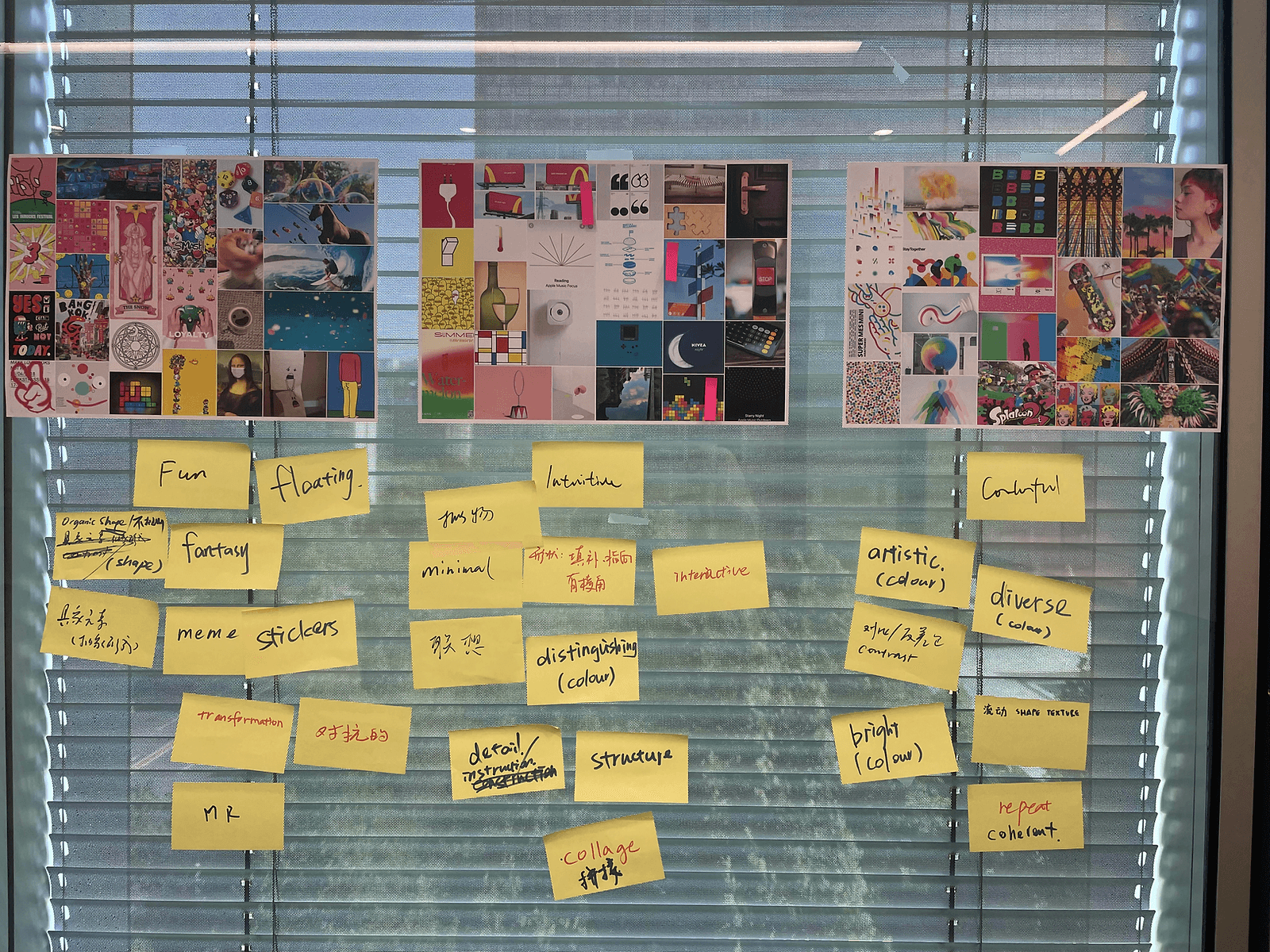
Used 720+ references to build three moodboards
Design language
- What problem we faced
Design language extracted from different boards are contradictory
- Our approach
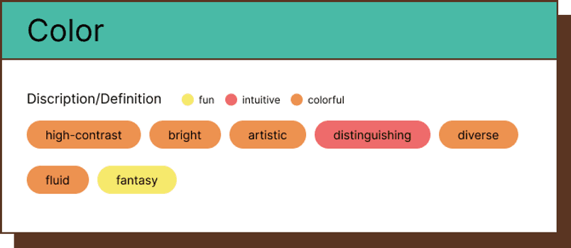
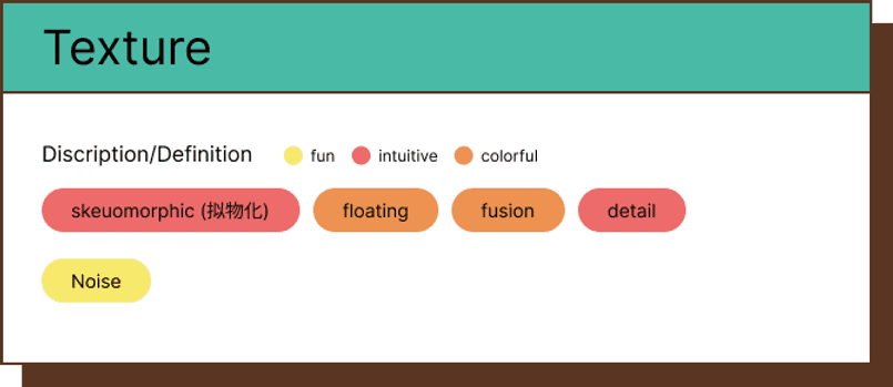
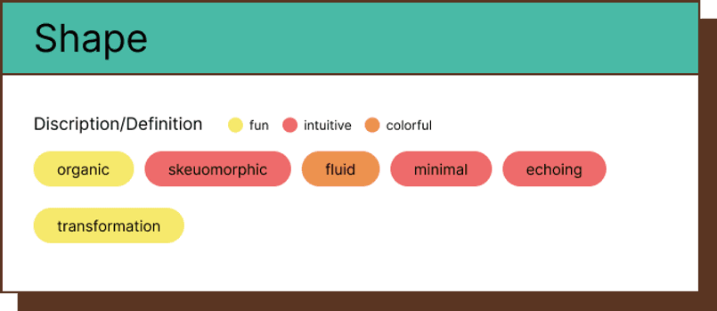
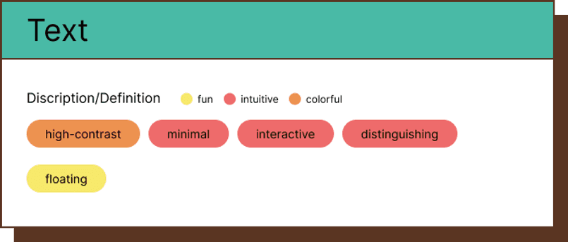
Extracting design language from moodboard is a diverging and converging process
- Extracted design language
Explore
- What problem we faced
Uncertainty about how to recreate proposals by leveraging these design language keywords, how to diverge. This required ability with long-term accumulation.
- Our approach
Try more. Try to be open-minded
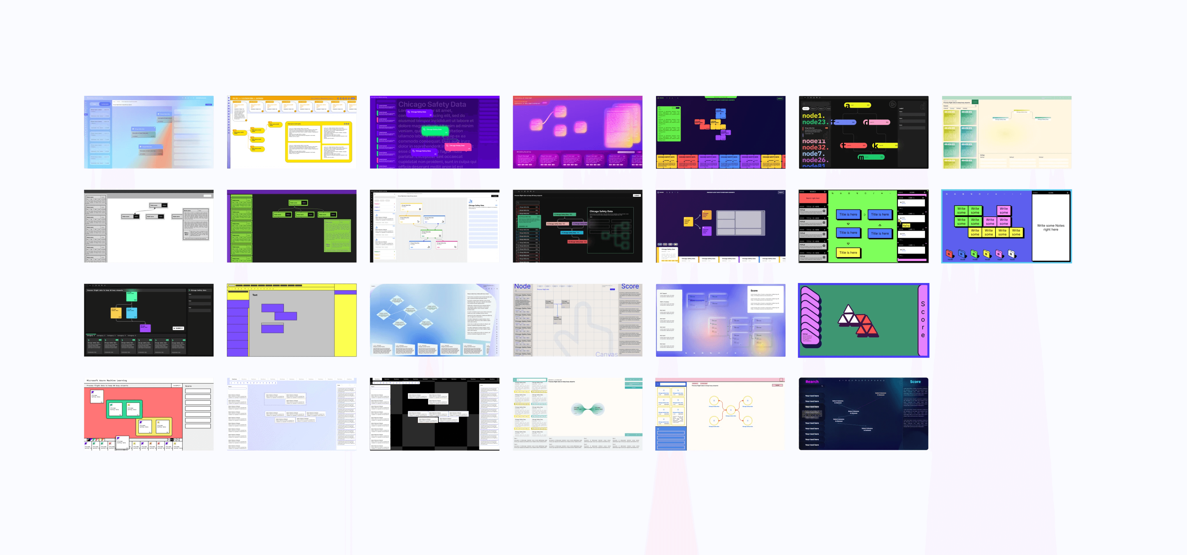
- Our proposals
- Top 4 selected by designers
Feedback
100+ feedback
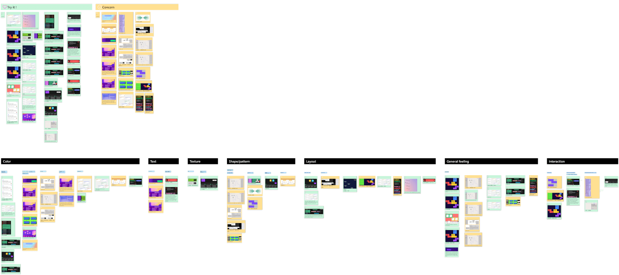
We invited devs, PMs, and designers from diverse teams to give feedback from the visual dimension, product dimension and tech dimension, and finally gained 100+ pieces of feedback in total
Then categorize them into the scale of color, text, texture, shape, layout, general feeling, interaction etc…
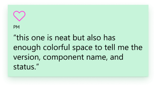
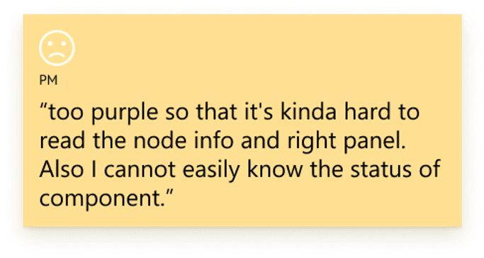
- Quote
Final design
- Our approach
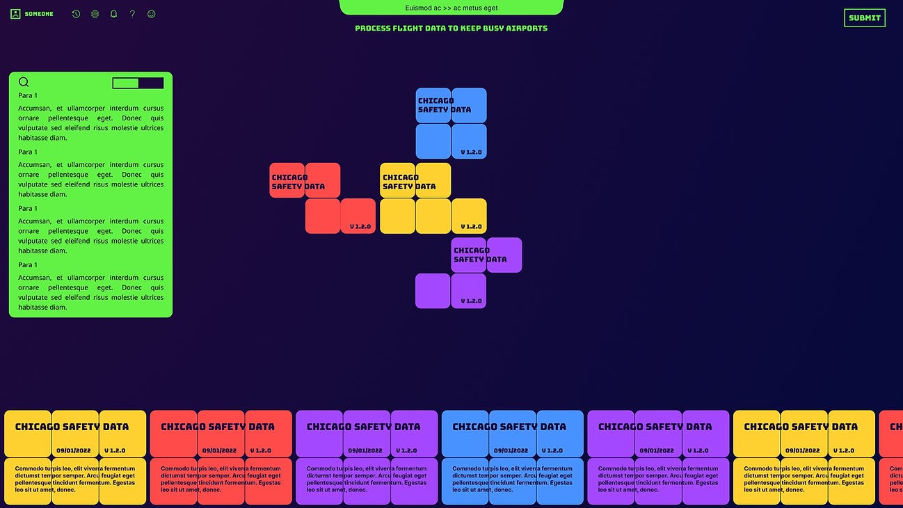
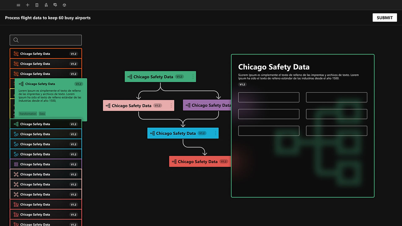
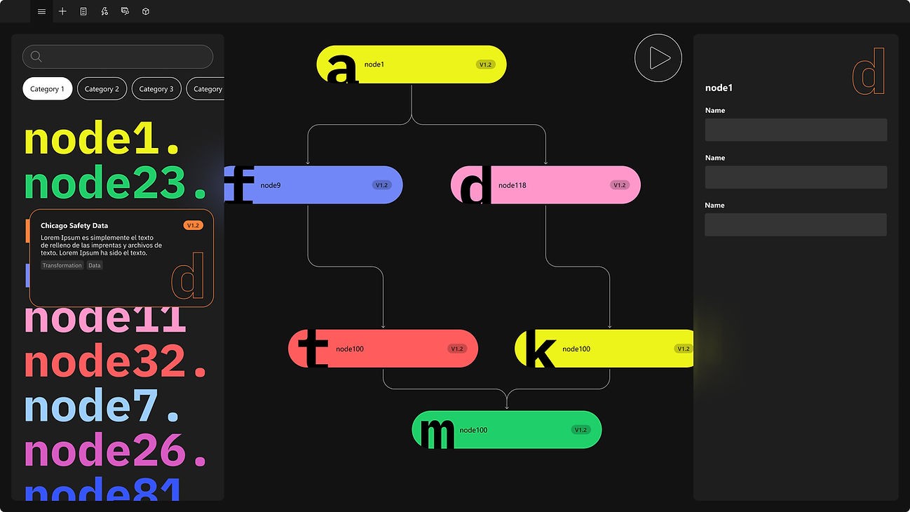
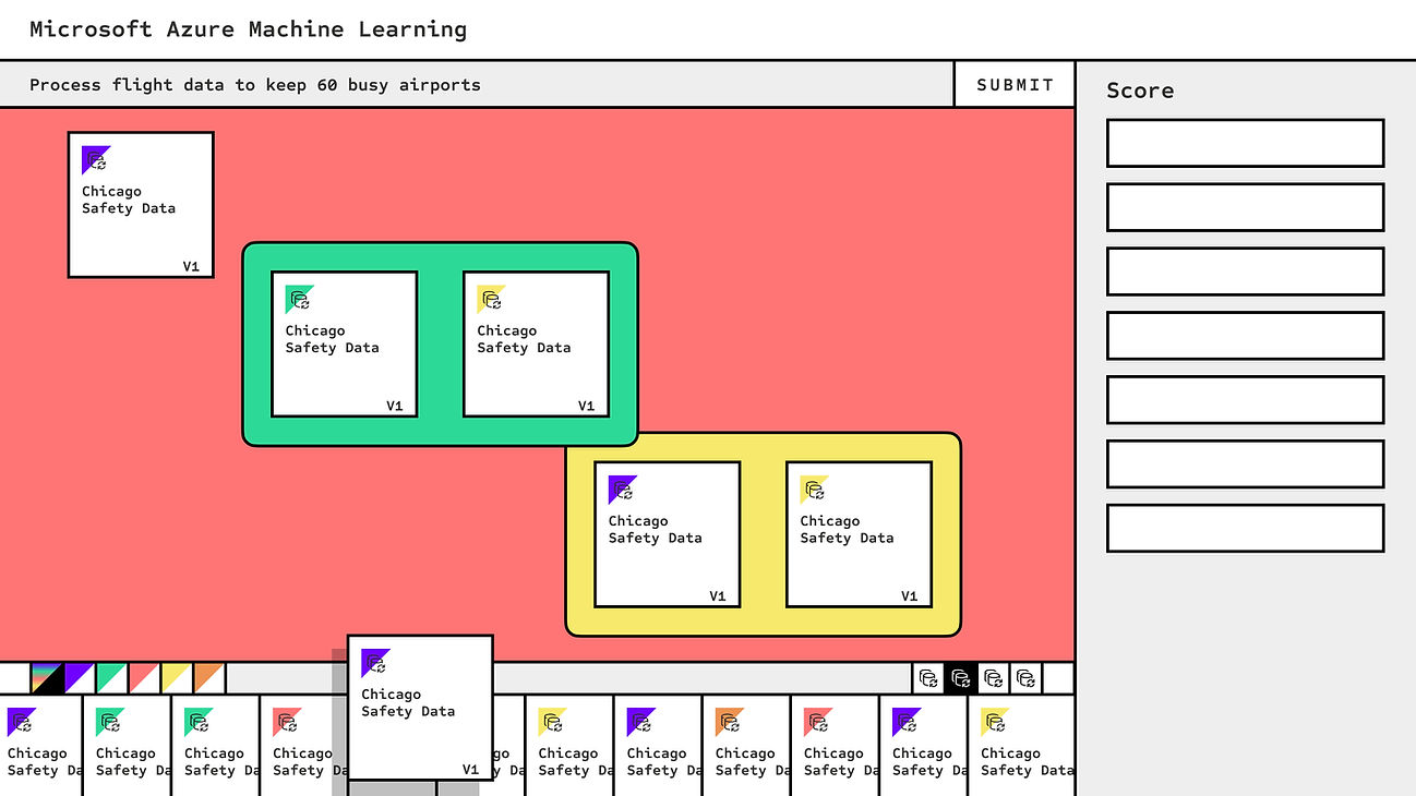
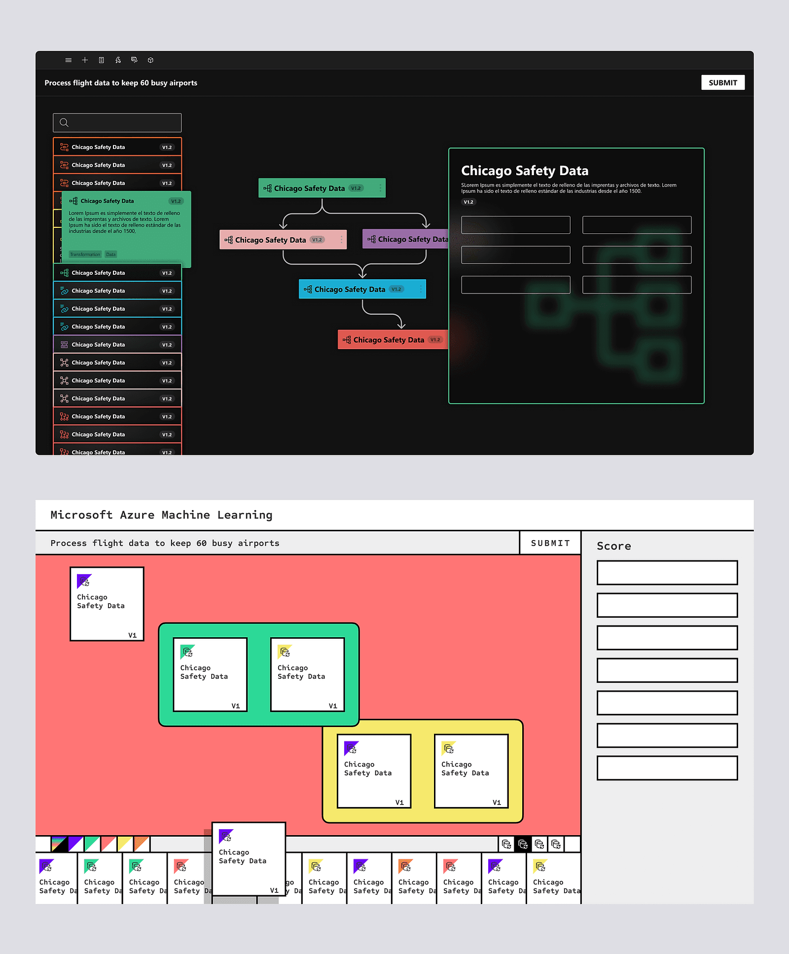
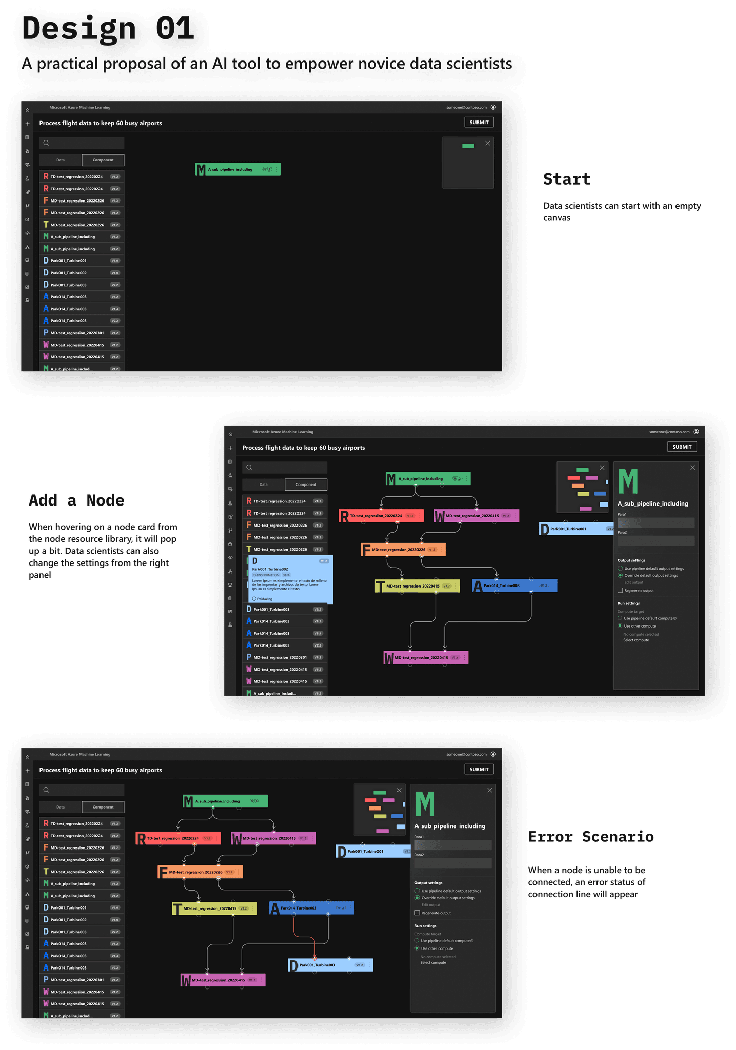
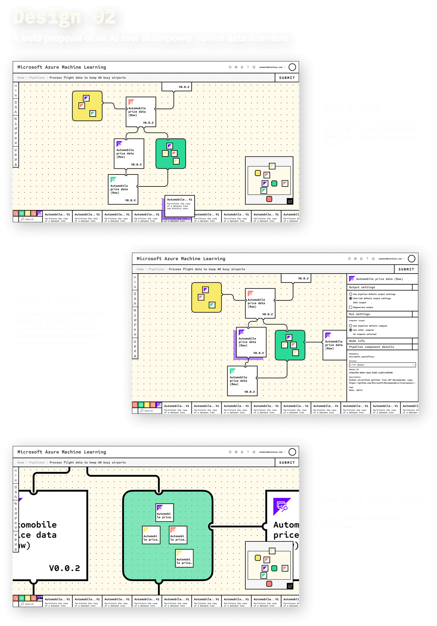
We chose two designs with more votes as well as consideration of feasibility to hone on visuals, and we also adopted suggestions extracted from other designs
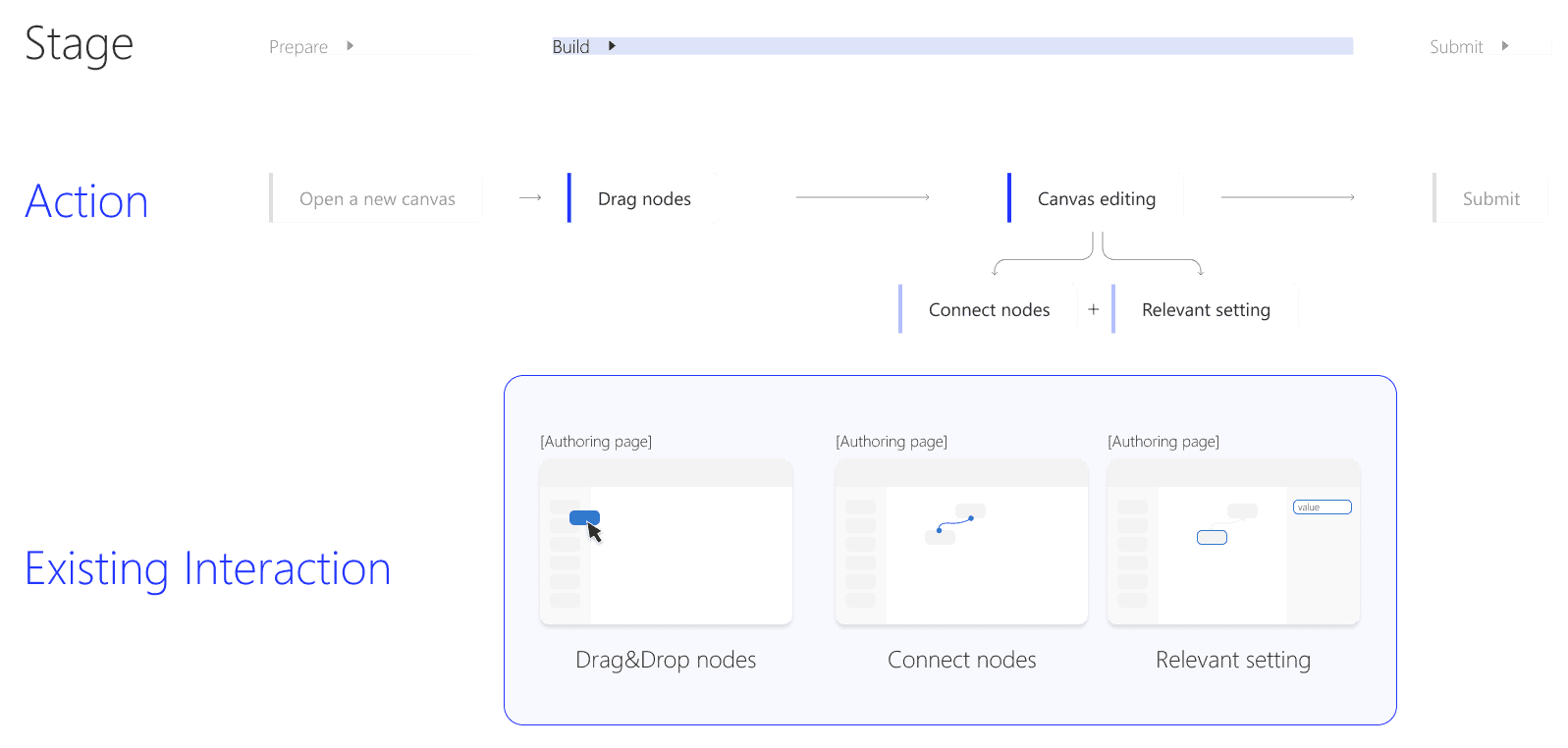
From the perspective of interaction, we mainly kept our eyes on three features:
